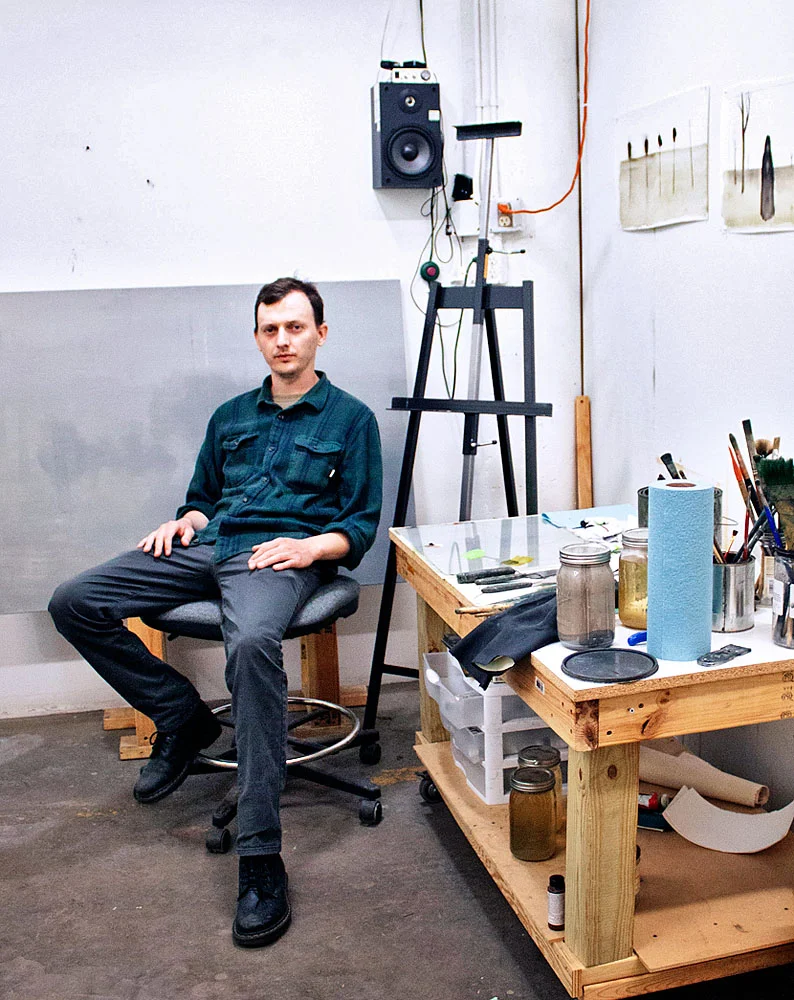
Rosalux artist Frank Meuschke talks with fellow Rosalux artist Jim Hittinger about studying art, working in Minneapolis, and takes a deep dive into his recent work.
You grew up in Michigan, was it suburban, city, or rural?
It was the suburbs of Detroit, not far from the city. Metro Detroit is massive, ridiculous sprawl. If you were to drive from downtown Minneapolis to the forest, if you drove that same distance in Detroit, it would still be six lane highways, strip mall hell for a while longer. So, yeah, I grew up in the Metro Detroit maze.
And that created who you are today?
(Laughs) I guess so, yeah.
Did you have a sense when you were younger that you wanted to study art?
I always wanted to be an artist. Honestly, earlier than I can remember, I was always drawing. It was always my thing when I was a little kid that I was good at drawing -that was my thing. You know some people’s parents are like “We’re not wasting money getting you an art degree!” But my parents were always like “Yeah, you should go to art school. You should be an artist.” So, yeah, I was always gonna do this.
That seems to me to be a less common story. Why do you think they were so supportive?
Yeah. Well my parents are academics. My dad is a philosophy professor and my mom has been an administrator at various schools and non-profits. So my parents are into the liberal arts I guess. They were always cool with it.
That’s great that you had that support.
My parents are interested in art. My family would go to museums; we’d go to the Detroit Institute of Arts and look at the collection on a Saturday.
Where did you go to undergraduate school?
Wayne State University. It’s a state school in inner city Detroit. It’s a bit like the U of M Twin Cities, where there’s a little nugget just inside the city that’s the campus -so that’s where I went to school.
Is it a school that is known for art study?
Yes, there is actually a really strong art program there. I don’t know that there was anyone who went there that is super famous, but Arthur Danto went to school there in, like, the late forties. The printmaking area had some of his old woodblocks and editioned some of them in my senior year.
I had no idea he was an artist.
He is better known for his theory and philosophy stuff, but he was also a printmaker.
It’s an intellectual pursuit, printmaking…
Yeah, I guess so. That’s why I don’t have the patience for it, not smart enough I guess. (Laughs)
I did not have the patience for it myself. Did you have to read his writings while you were a student?
No, honestly, I think I had to read his stuff more in grad school at the University of Minnesota than I did in undergrad.
Was there a particular professor that stood out for you as a resource or mentor?
Jim Nawara. His work was very different from mine. He makes very traditional, hyper-realistic landscape oil paintings. He paints meadows and streams, very traditional. I think that was great for me to have because even though I do not make paintings like that, I learned a lot about paint. He was obsessed with paint! He was the type of guy you would ask, “should I use this color or this color?” He’d then talk to you for like an hour about the differences between the pigments and oils used in this one versus that one. There were a lot of formal things that I just didn’t know about paint; which I know talking shop about painting bores the hell out of people who aren’t painters (laughs). So there is a lot about that that I learned from him that has been invaluable to me.

James Nawara, Blue Fence, oil on linen, 1999
It sounds like you were not going to resist going to college or say, “Screw this, I’m going to LA to be an artist.”
Well, the thought crossed my mind. I think I may have been more likely to do that if I didn’t have the support that I had. But you can go to college for art and I was like, okay, why not? I’ll have to take other classes, but I’ll get a cheap, shitty apartment in Detroit and go to art classes and hang out for four years. Sure, I entertained the idea of not doing that, but it wasn’t a hard decision. In school you get to learn your studio practice, you just kind of learn how it all works with some training wheels on. Going to exhibitions, talking to your professors about how you make money! Do you sell your work? Where do you show your work? Who do I have to talk with to show my work? It’s important to learn that stuff while you have this community safety net and I think that’s a really invaluable thing.
Did your teachers have an answer for you when you asked these kinds of questions, like, how do you make a living?
Yeah, I would talk to my professors a lot about that. And they were always encouraging me to try to show work outside of school. It’s like the best thing you can do to get the ball rolling is to show some work that’s not just the end of the year BFA exhibition. There are open calls at this gallery and this gallery, so I think that was a really helpful thing to learn. If I had decided when I was 18 to move to LA and figure that out for myself, I probably would have eventually figured it out, but I am glad I had that help to figure it out.
So you were actively showing while you were in undergraduate school?
Yeah. I think that was a benefit of being at a school that was in a city. Just being in a city that had a whole art community and art scene happening completely outside of school was really helpful.
So what brought you to Minneapolis?
Grad school.
How much time between undergrad and grad school was there?
I came right away. I wasn’t even expecting to get into grad school right away. I was looking for state schools that had teaching assistant opportunities, funding, but I wanted to be in a city. I didn’t want to be in some off the beaten path college town. There are some really good MFA programs you can go to, but you’re in kind of the…
Cornfields?
Yeah. Exactly. So the University of Minnesota checked all the boxes for me. So I applied and got in and came. That was in 2012. I finished in 2015 and I’m still here ‘cause I like it here.
Sounds like staying here was a pretty easy decision.
Yeah, I was planning on staying for at least a little bit. But I’ve been here long enough now that I feel at home here. Not necessarily certain that I will live here forever, but I like being here right now.
So the U has been a kind of anchor for you after graduation?
Yeah, a lot of my best friends in town I know are from there and are doing lots of different things. If you are just going to uproot and move somewhere, it’s definitely good to have a built-in community.
What was your biggest struggle as a painter? What do you worry about, artistically?
My painting sucking! (Laughs)
So you weren’t worrying that painting was dead or where will I go with painting?
I think that is always there. There’s always going to be people who think painting is for idiots who just want to make pictures.
But not painters. It’s hard to be a painter who thinks that.
Yeah, that would be interesting, actually, if you were. I never had much of a concern about that. There were enough other painters on the faculty and in the program that there was always a good conversation around painting and about what painting can be, where it can go, and what possibilities there are with it.
How broad is your definition of painting?
I don’t think I really even have one. It can be so many different things. If you are applying paint to a surface to make an image of a thing, you can separate these two things. Applying paint to a surface goes one way and making an image of a thing goes in the other direction. You could be working just with the idea of imagery, with making a representation; that doesn’t have to involve paint or traditional painting or drawing tools at all. There are also artists who are using painting materials to do something that doesn’t really look like painting at all. So I think there is a pretty wide and deep definition of painting now.
I imagine painting as being on of the broadest disciplines. For example, I like to think of photography as a kind of drawing. As a painter I sometimes made photographs as preparatory work, and I thought of that work as a kind of drawing. So now primarily working with photography, I see that as a kind of drawing too.
Yeah, I think more and more the idea of having a medium and sticking to it is not super important. Going back to art academia, there is an interest in blurring the lines between your study areas. I think this is a good thing, probably.
What brought you to Rosalux? You must’ve known about it while you were at the U.
I applied for the Open Door show in 2015 or 16 and had one or two paintings accepted to that. Maybe six months after that show there was an opening in the roster, and I got an email from, maybe it was Terry, saying this is what the gallery is and we are looking for a new member. It wasn’t an invitation to join, but it said I should think about applying for the open spot. So I did.
How’d that make you feel?
It was pretty cool, yeah.
I have a short list of exhibits that really impacted me as a young artist. Do you have any that had that effect on you?
There is one show, about ten years ago. I saw an exhibition of Vija Celmins work at the Menil Collection, in Houston. That’s one of the best things about my parents living in Houston now. Every time I am down there for Christmas or whatever, we go to the Menil Collection because it’s such a great museum. There was this huge show. It was called Television And Disaster. I bought the catalog for it, and I don’t usually do that, because who has the money for exhibition catalogs, but I had to get this one. It was great because I was already a fan of her work, pouring over images online and in books. It was great to get to see a lot of that work in person. She has done a lot of different types of work over decades, but it was specifically a lot of paintings of these hyper-realistic TV news stills…
Like a ship blowing up?
Yeah, yeah, a lot of stuff like that. She has this amazing way of painting those things where it isn’t just a painting of the event seen on the news. It really feels like a painting of the television screen of the event happening. She has this really fucking brilliant way of capturing that filtered experience with paint, which is something that I am really interested in doing. She has always been an important artist for me and I got to see a bunch of her most iconic work in one place and it was amazing.
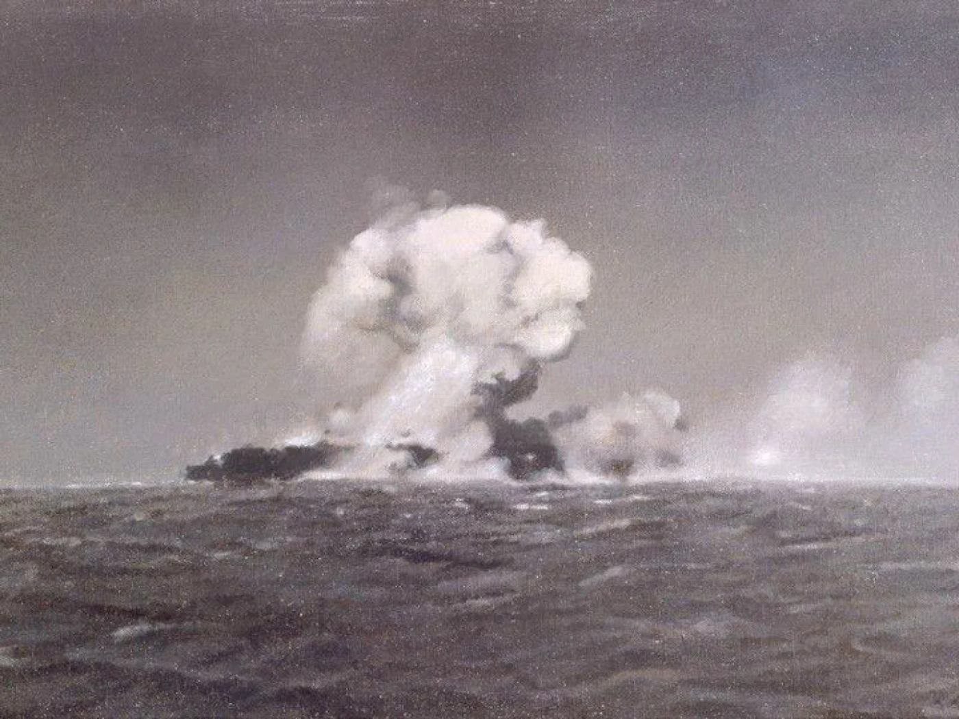
Vija Celmins, Explosion at Sea, 1966, Oil on canvas
Celmins seems to exist on this plane of Agnes Martin. I have no idea what her life is like, but I imagine it as an ascetic kind of life. Maybe it has something to do with all that detailed rendering, the pencil work. It’s like, if Agnes Martin had watched TV all the time, you’d get Vija Celmins. (Laughs)
I always show my intro to drawing students some of Vija Celmins' drawings, some of those insane drawings she did of aerial water views. I tell them, "This is a pencil drawing by one of my favorite artists, just so you know here is a possibility for graphite drawings."
Does that blow them away?
Yeah, usually it’s “whoa!” It’s part of the first day lecture showing them a bunch of photo-realistic renderings in graphite; now here is a bunch of stuff that is not that, but are still very good drawings. It’s to show intro students that you do not have to be able to do a Vija Celmins water drawing to make a good pencil drawing. It’s a way to get over the fear of “does it look realistic?” I show Vija Celmins to say, “Here’s what you’re not likely to be able to do and that’s okay.” (Laughs)
Who’s work are you connecting with right now?
Aleksandra Waliszewska, a painter from Warsaw, Poland. Her work looks very different from my own and deals with different themes and ideas, but I think there is still a lot of overlap. I'm interested in how she presents these bizarre, fantastical images with a decidedly un-fantastical aesthetic. Her paintings show these surreal, nightmare scenarios, painted in this very matter-of-fact way in drab color schemes, mixing fantasy imagery with mundane scenes from contemporary life.

Aleksandra Waliszewska, Untitled, Gouache, 2012-2013
Did you have a moment that defined your point of view as an artist or has it been a steady evolution?
I don’t think that there is really a specific moment where that happened; I think it’s been a constantly evolving process, but I’ve had a lot of similar interests and aesthetic preferences for a long time. If I look at work that I made ten years ago, I’m like “what the hell? This looks so different and I would never make this now.” But work I am making now doesn't seem any different from the work I was making six months ago. There was never one moment where there was a hard left turn. Little, incremental things change.
So if you put that work that you made when you were 20 side by side with the work you are now making at 30, an observant person might recognize a connection or do you think not really?
Yeah, yeah. I think that there has been a kernel of what I am doing now in what I have been doing for a long time.
What would you say about your work is unique to you, what is the Jim Hittinger genius, and when did you become aware of it?
Well first of all, I definitely would NOT call myself a genius! (laughs) But probably when I was in grad school. That was a big part of what that experience was; having discussions with faculty and peers about those kinds of things and trying to unpack what it is that you are doing and why. How could you be doing this differently or more effectively? That was really helpful.
Did you have a moment of crisis?
I had some moments of trying to completely blow up what I was doing and try to do something completely different. Every time I would do that I would find myself, before I knew what was happening, making work that looked just like the stuff I was trying to get away from. Sometimes that was frustrating. But there is something there. There is some reason why I keep making this decision, this decision and this decision even if I try to completely stop and do something else. So, that was a good way to identify what those things were so that I could start thinking about why I make those decisions. What is the significance of these decisions, look at each decision independent of the others, and identify what is important and what is not.
When I look at your work, one thing that strikes me right away is your color choices. There isn’t a lot of color, but the color that there is, is very strong and you are fairly consistent with that across your work, at least over the last five years or so. Your color feels like it is loaded with something.

Search Party, Oil on Paper, 2015
Color is really important and that is a relatively new thing. The work before grad school and some during grad school had no color at all. I was making gray, brown, muddy, murky paintings. That’s not to say I wasn’t thinking about color. I was actively thinking about making different kinds of muddy, earth tones and grays, and how I could make different non-colors interact with each other in an interesting way.
The super bright colors, that was something I would never do in a painting that I thought I should try and see what happens. Maybe I should use some neon orange and see what happens. I started thinking about how those types of colors are usually reserved for a kind of code that everyone understands to mean caution or danger. These colors appear on traffic barrels, the lane is ending, the “X” they paint on diseased trees and it has to go, or construction safety vests. These super bright colors were perfect as a formal foil to the gray murkiness but also made sense conceptually.
It is a visual, formal thing but it is not extraneous because it speaks to the content of the work. If I do a series of paintings where this orange shows up in one image on a traffic cone and another image it's on a guy with a safety vest and then another image there is an inflatable pool that is the same color, then the inflatable pool becomes part of the code where there is something dangerous. Now this banal object, this dumb object, gets put in the same category as the “oh, shit, this is dangerous stuff.”
So these colors came out of a formal rut but there are a lot of colors out there and you chose very specific industrial colors that elicit an emotional reaction. Danger or warning aren’t emotions, but maybe these colors elevate the cortisol a little bit -there is a danger here.
The orange and the green, but particularly the orange, suggest the fluorescent crayons I had as a kid. I didn’t use these colors for most of the year, but in September and October I used them to make my Halloween pictures and this association is indelible.
Oh, yeah, yeah.
There are some Halloween characters in your paintings, but I don’t think your paintings are about Halloween. Would you talk about that?
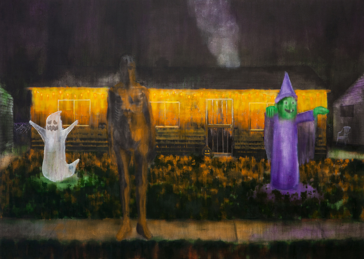
Devil's Night, Oil on Canvas, 2015
One of the biggest things I am interested in exploring through my work is the idea of the uncanny, stand-ins, and substitutes for things. There are these symbolisms for grander ideas like mortality, spirituality and death. These huge ideas that people always grapple with get turned into a visual shorthand, in a similar way to how the colors mean “pay attention here, there is something dangerous here.” The way this holiday has evolved, Halloween and even Christmas, other rituals and festivals have these lofty ideas, but to symbolize the idea of the afterlife we are going to put some plastic ghost on our lawn. They become this fake, dumb plastic effigy to something that is actually an existential dread. Those colors tie into that, too, where anything that is that color isn’t real; this isn’t found in nature, it is something that is put here.
So the colors operate in a similar way, as a kind of stand-in. The orange is dumb, in the sense of not containing a lot of information and that, on the face of it, may conceal the extent of the danger. It says beware, but there is quite a lot of breadth between the sign and the actual danger. This makes me think about how painting itself operates in the same way, as a kind of stand-in where there is a lot of distance between the face of it and its impact.
In your painting Behind the House, 2019, a bright green, inflatable kiddie pool suggests to me the innocence of childhood. It’s as if the kiddie pool establishes the footing I need to view the work. There is an adult, face blackened, standing in the kiddie pool. Drooping shoulders present a kind of disappointment, as if the kiddie pool could have returned that adult to childhood innocence. Instead the water is black; its clarity appears sullied by the figure itself. Why did you title this work “Behind the House?”
Sure, the pool is a thing I’ve used a lot and also the white plastic lawn chairs. Because those are, and this is going to maybe answer the question you were asking about painting being that exact thing, those are things that are so recognizable if you grew up in the American Midwest. I use these dumb, mundane, objects like the pool, chairs, and chain-link fence as a comfortable, domestic thing so they can be like an inflatable Frankenstein. These can be painted in such a stupid way, but it will still be very clear what it is.

Detail, Parking Lot, Oil on Paper, 2015
The white plastic chair is a good example. Even if I do the crudest, laziest job of painting that shape, I think that it will still resonate for a lot of people -you know what those chairs feel like, you’ve stacked them before. So these become like a symbol of that domestic setting that you’ve experienced. That’s the purpose of all that stuff, to establish that you’ve seen this before; you’ve been here before. But now something is wrong back here and I juxtapose those types of things to show an underlying anxiety and dread that is going on even when we are in these comfortable surroundings.
As for the Behind the House title, I really like giving titles that are just “this is what it is;” not getting super poetic with titles. What is the difference between saying “In my backyard” and “Behind the house?” There is something upsetting about how cold and mechanical it is to say “behind the house” instead of “in the backyard.”
I read some poetry in that title. It isn’t in the specific words, but in the intent, so if I saw you on the street and you asked me, “Where’s the barbecue?” and I said, “It’s in the backyard,” that would be inviting. But when I say, “It’s behind the house,” there is a coldness to that; maybe its dangerous.
Yeah, this guy is going to kill me if I go back there.
What’s going on behind the house? It’s all those things that happen out of sight of the public. It’s all those aspects of living that you may want to hide. It operates maybe in the same way as a chain link fence. If I am going around a house, to the back, and there’s a chain link fence, there may as well be a barking German shepherd there too. Automatically I am on guard and maybe I shouldn’t go back there. The twist in the artwork is that I am imagining what may be happening behind the house when I read the title, what I cannot see, but you are showing us what’s back there.

Behind the House, Graphite and Gouache on Paper, 2019
Tell me about the blackened head and torso?
I’ve been doing this for a long time. The treatment of human figures is to make them anonymous. People say, “it’s ghostly," and that makes sense, but I bring this on myself because I use horror movie imagery. I never think of them as literal ghosts.
I don’t get that from them either.
I am paying attention to anatomy enough that we can empathize with the form that it takes, but making them hazy, fuzzy, and not totally distinct, especially compared to the other stuff in the paintings, is a way of denoting that this thing is alive and sentient whereas everything else in the painting is really flat, or painted as a pattern. I am finding ways to paint these familiar things in a way that isn’t what the thing looks like in real life, but as some sort of stupid symbol of it. Then, by painting the figure that way, without making it a super realistic rendering of a person, it becomes a different formal way to show that this is a different type of entity than all the other objects. Maybe I shouldn’t resent the "ghostly" thing.
Maybe it’s not so much a ghost, but more the spirit. The first thing that comes to mind when I see this figure is representations of the grim reaper. Not the scythe and all that, but it’s the black within the hood, it’s this void. That’s what we’re afraid of, that’s what the death represents -this void. You enter into it, but really it sucks you in. The blackened head and torso draws me in to some kind of internal space that I do not really want to find myself.
Your painting Procession, of 2017, I see as your most Celmins-like painting, now that I know the influence her work had on you. It has the sense of being seen on TV. In fact, when I imagine a funeral procession of vehicles, I picture the way it looks on TV. I know Kennedy’s procession was with horse and carriages, yet somehow I imagine this procession of black cars as seen on TV!
Maybe you’re thinking that because you are getting the funeral procession crossed with the memory of Kennedy being assassinated in a car procession seen on TV.
Probably. There couldn’t be anything more dry and dull to watch on TV than a funeral procession of cars. Yet, there it is in your painting and to me it has this sense of abstraction, of distance, as if it was on a TV screen. Am I reading that right?
I wasn’t actively thinking about that layer of it when I was making it, but it makes sense, I can see that. Also, since we were talking earlier about the huge influence that Vija Celmins had on me, I think there may just be a subconscious thing where the way I like to paint things is so rooted in being into Celmins that I would do something like that without even thinking about it.
So there is always this death, mortality, and morbid fascination but a hearse is such an easily identifiable thing that that is one of those things [like objects in my other paintings]. Two other cars are part of the procession. One is my car that I had at the time and my wife’s car. The other one is the hearse; it has this ornamental landau bar on the back. We know what that is. We know this is just a car and this is a car to carry dead people to a ceremony. And it has the little orange flags on it. You get the magnetic flags to stick on your car and it is that same orange color [as in my other paintings]. I’ve been looking at a lot of 19th century Russian realist painters making these super bleak paintings of Russian peasant life, like Vasily Perov. And there were a lot of funeral procession paintings. So I’ve been looking at all these paintings of Russian villagers doing funeral marches through tundra and I was like, I am going to do a 2017 version of this.
If it was only a hearse, I’m not sure I would have known what to make of that, so it needs the two “regular” cars. Feeling disconnected, maybe due to the sense of the TV screen, leads me to think about how I feel disconnected from my own death. This seems part and parcel to ideas you were talking about earlier about the color of warning, the orange. Feeling disconnected is part of being on this side of the symbolic. We are all living under the Covid-19 pandemic, more than 125,000 people are dead, yet still, those of us alive and well are somehow not affected by it and are disconnected from that possibility of death. So when I look at your painting I see death and yet somehow it’s not me.
Yeah.
And yet it is and still it isn’t. It’s haunting in that way.
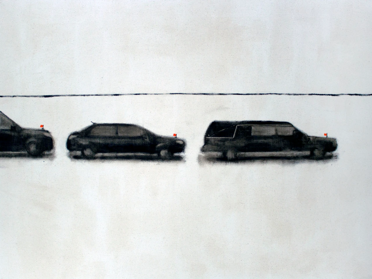
Procession, Oil on Canvas, 2017
Yeah, that disconnect part of it was part of my motivation. There were all these opportunities in this image for formal experiments but then also being able to put the profound ceremonial thing and stick it in with some objects that are more comfortable and familiar. Like you said, if it was just the hearse, it would be a very different thing. It’s the hearse in relation to the other cars that was the thing; comparing a hearse with a 2010 Ford Escape was the thing I was interested in. The hearse might by like, oh that’s not me, that’s the disconnect, but the 2010 Ford Escape -that’s fuckin’ you dude!
In a sense, it’s that aspect [the Ford Escape] that makes it real, the particularity of the vehicle. Which is funny because I tell people cars are the hardest things to draw because we all know exactly what they look like.
They are hard to draw! If you are off a little bit, it’s fucked up!
You could draw a human body off and it would be fine, but when you get a car wrong, it’s way off. We know them so well they are like stand-ins for ourselves. It’s a way of putting yourself back into the painting.
In your painting, Burial At Sea, 2019, you have a lone figure attempting to push a beached whale back into the sea. There is something absurdist and surreal about it. Even if a lone person could push a whale into the sea, there is the sea pushing it back onto land -a terribly Sisyphean prospect. What had you thinking, from Minnesota, that you should make a painting of a dead whale on the shore?
Well, as we have been talking, it often comes back to thinking about mortality. I think it’s something that everybody is thinking about all of the time, but maybe don’t make artwork about it (laughs). I look at this painting and say, “what the hell?” This one is very different than other stuff that I’ve made. I guess that was the best way I could think of to use an image to talk about futility, to wrap your head around the idea. This thing is obviously dead and it’s also fucking enormous and not from your realm. Whales are scary, they are fucking huge, they live under water, and they are not part of our world. Just to see a whale on the land…
Fish out of water, man.
I know that these things exist, but it doesn’t belong here and I don’t know what the hell this thing is. The thing I wanted to get the most right in this painting, a key thing, is to have the illusion that the figure was pushing, and bracing itself on the land, and pushing as hard as it could.
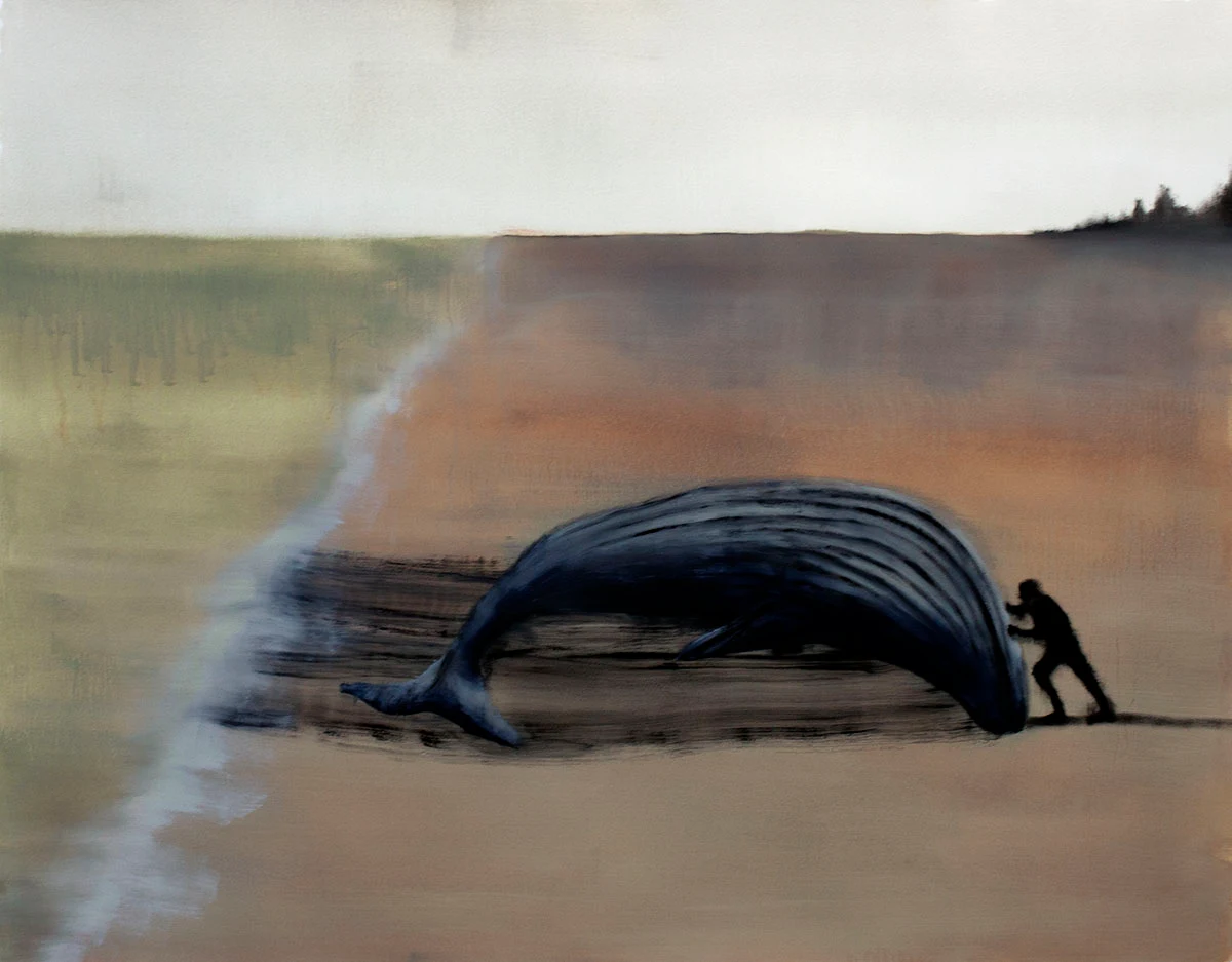
Burial at Sea, Oil on Paper, 2019
For me, it’s like pushing away the idea of death. Maybe I can put it back where it belongs -the dark, incomprehensible depths of the sea. Having grown up near the ocean, I innately understand how the waves push everything right back; so you can try to push it out, but even if you could, there is something bigger than you pushing it back. So you have to confront this death, as big as a whale. It’s a really good painting as it really captures a lot of this idea, but with this sense of activity, of pushing it, of trying to push it away. You’re not trying to save the whale; you are trying to get rid of it.
I could run off with ideas about climate change because whales have become a symbol of ecological calamity, that is hard to ignore, but I don’t think that is what this painting is about. It’s about an awareness of our struggle with our own death and that this death is a lot bigger than us.
Yeah, you know it does read as something absurdist and surreal, but compared to every other painting I’ve made, this is the most realistic. Whales do wash up on the shore, this happens in the real world, but it is such an insane thing that seeing a painting of it is totally absurd, but it happens!
And when you see it, there is a sense of the world being out of order.
I find myself in a confrontation with the deep sense of my own aloneness in your work. Is that intentional?
Yes, the sense of loneliness and isolation is definitely intentional. I want the images to feel like they exist in a vacuum to a certain extent. They are representative of things from the "real" world, but I want them to feel sort of anonymous or like they are happening internally, like a memory of an event rather than the event itself captured in real time.
I like your new animations. Tthey are both humorous and sad, and contain many of the themes found in your paintings. Why animation? Tell us about your graphical choices -particularly the use of 8-bit graphics?
Animations are a way for me to incorporate an element of time and movement into the work. The time and movement is pretty minimal, but I think it makes a huge difference. If I do a painting of a plastic bag stuck in a tree versus an animation of it, where it is almost entirely static except for the bag getting blown by the wind very slightly, that opens a lot of possibilities for what the work can do.
The vintage video game style is for a few reasons - one being that I am by no means an expert in animation or digital drawing, and working with low-res, pixelated images makes things easier to animate. It's just a matter of moving a few pixels over between animation frames. I'm also an avid video game-player, and there are a few games that actually strongly influence my painting work, particularly open world fantasy role playing games. Animation is a way to for me to more directly interact with those influences.
Untitled, Digital Animation, 2019
The long-term plan is to actually make a video game, which I have started on! I've actually been working on it for a few years now, but it's slow going since I have no idea what I'm doing. The only "training" I have in this is looking up tutorials and reading Reddit threads about pixel art and game design. I do have a super crude version of it working, which is basically an overhead view of a neighborhood that looks like the settings from my paintings. It’s done in a Super Nintendo RPG style where you can control a little figure to walk around, but that's about it so far.
Jim Hittinger is an artist based out of Minneapolis, Minnesota. He works in several media including oil, gouache and watercolor painting, graphite and charcoal drawing, and digital animation. Duplicates, the uncanny, mortality, and unseen forces lurking just out of sight are recurring themes in his work.
Jim received his MFA from the University of Minnesota, Twin Cities in 2015. He’s a member of Rosalux Gallery, an artist collective in Minneapolis. You can learn more about Jim and his work at: https://www.jimhittinger.com
Frank Meuschke received his MFA from the New Mexico State University in 2000. He’s also a member of Rosalux Gallery. You can learn more about him and his work at www.frankmeuschke.com
No comments:
Post a Comment